Type

Type

End-to-End UX/UI Design

End-to-End UX/UI Design

Client

Client

ToadEx Inc.

ToadEx Inc.

Skip the line.

My Role

My Role

Lead designer

Lead designer

Tools

Tools

Figma

Figma

Note

Note

This kiosk ordering flow was designed for a client project currently in development. To protect the clients in-progress product and avoid showing unreleased restaurant details, I created a fictional matcha café brand, Matcho Matcho, to showcase the UX flow, screen structure, and customer experience strategy.


This kiosk ordering flow was designed for a client project currently in development. To protect the clients in-progress product and avoid showing unreleased restaurant details, I created a fictional matcha café brand, Matcho Matcho, to showcase the UX flow, screen structure, and customer experience strategy.


Industry

Industry

Restaurant Tech

Quick-Service

Restaurant Tech

Quick-Service

Deliverables

Deliverables

  • White-label Self-Service Kiosk Flow

  • Upsell & Checkout System

  • Research

  • Responsive Website

  • Creative Direction

  • UX/UI Design Wix

  • Website Build

  • Inquiry Flow

Designing a Faster Self-Serve Kiosk Experience for Restaurant Customers


ToadEx builds ordering technology for small and quick-service restaurants. Created the initial end-to-end ordering flow from the first tap to the final order number using the psychology of customer behaviour to cut wait times, lift order value, and make self-service feel effortless for first-time and repeat guests alike.

Designing a Faster Self-Serve Kiosk Experience for Restaurant Customers

ToadEx builds ordering technology for small and quick-service restaurants. Created the initial end-to-end ordering flow from the first tap to the final order number using the psychology of customer behaviour to cut wait times, lift order value, and make self-service feel effortless for first-time and repeat guests alike.

Problem + Approach Section

Problem + Approach Section

Restaurant kiosks need to move fast without making customers feel rushed.

Restaurant kiosks need to move fast without making customers feel rushed.

Customers using a self-serve kiosk are usually making quick decisions in a busy environment. They need to understand the menu, customize their order, review their cart, and complete payment without confusion. At the same time, restaurants need the flow to support add-ons, combos, and upsells without slowing customers down.

For this project, the goal was to design a kiosk experience that balanced speed, clarity, and revenue opportunities from the first tap to the final confirmation.

Too many choices can slow users down

Menus with categories, modifiers, add-ons, and payment steps can quickly become overwhelming if the flow is not structured clearly.

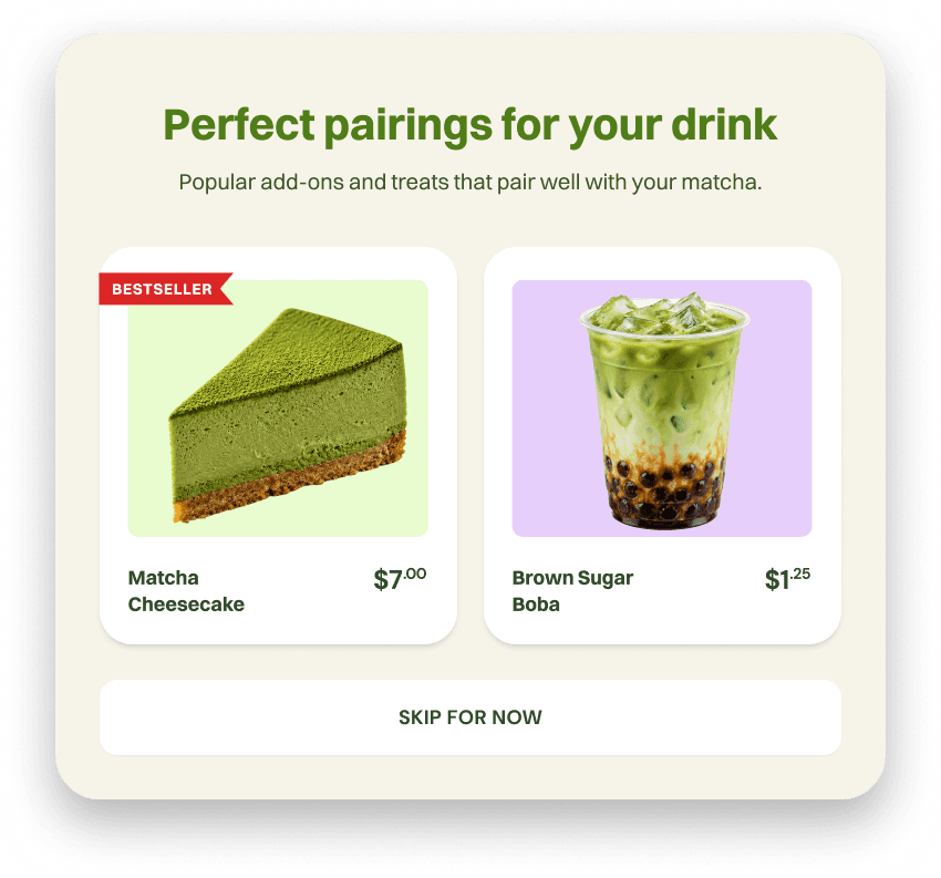
Upsells need to feel helpful, not annoying

Prompts work best when they appear after a customer has shown intent, rather than interrupting the ordering process too early.

Checkout needs clear reassurance

Customers need to know when an item was added, when payment is processing, & whether the order was successful, cancelled, or needs attention.

Designing around how customers actually make ordering decisions.

Designing around how customers actually make ordering decisions.

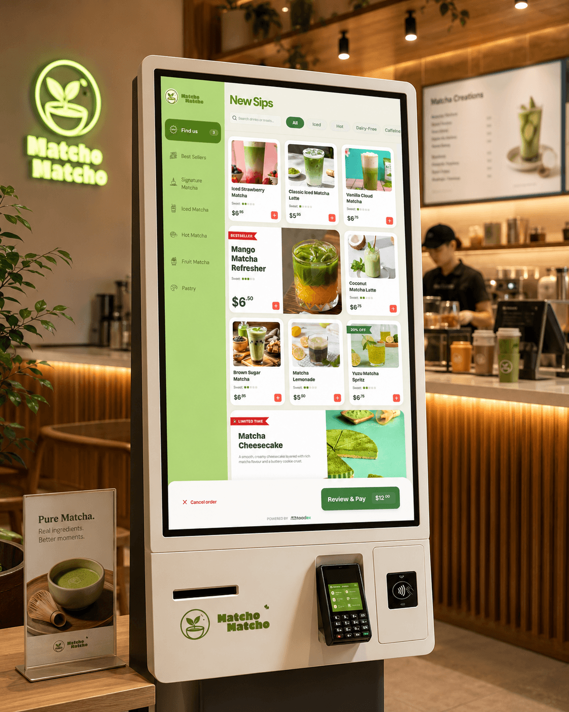
I approached the kiosk flow through the psychology of customer decision-making. Instead of showing everything at once, the experience breaks ordering into smaller, focused steps: browse, choose, customize, review, and pay.


Each screen was designed to reduce cognitive load while still giving customers enough control to feel confident in their order. The goal was to make the experience feel fast for the customer and valuable for the restaurant.

The strategy was simple: make the next step obvious, make choices feel easy, and place upsells where they feel natural.

Visual recognition first

Visual recognition first

Large product imagery helps customers identify what they want faster than reading through a text-heavy menu.

Progressive choices

Progressive choices

The flow separates browsing, customization, cart review, and payment into clear steps so users are not overwhelmed.

The flow separates browsing, customization, cart review, and payment into clear steps so users are not overwhelmed.

Contextual upsells

Upsell prompts appear after the customer has selected an item, making recommendations feel timely instead of disruptive.

Clear recovery states

Editing, removing, cancelling, and payment states were designed so customers always understand what happened and what to do next.

Editing, removing, cancelling, and payment states were designed so customers always understand what happened and what to do next.

Ordering Journey

Ordering Journey

Mapping the full kiosk journey from first tap to checkout.

Mapping the full kiosk journey from first tap to checkout.

I designed the complete self-serve ordering path across every key customer moment: starting an order, browsing the menu, selecting an item, customizing options, accepting or skipping upsells, reviewing the cart, paying, and receiving confirmation.

The goal was to make the flow feel predictable from beginning to end, so customers always knew what to do next while the restaurant could still guide them toward add-ons and higher-value orders.

Outcome + Design Impact

Outcome + Design Impact

A complete kiosk experience designed for speed, clarity, and higher-value orders.

A complete kiosk experience designed for speed, clarity, and higher-value orders.

The final flow gave ToadEx a polished self-serve ordering experience that covers the full customer journey: browsing, customization, upsells, cart review, payment, and confirmation.

Even though the product is still in development, the design system and flow structure create a strong foundation for a white-label kiosk product that can adapt to different restaurant brands.

The strategy was simple: make the next step obvious, make choices feel easy, and place upsells where they feel natural.

Faster ordering flow

The experience breaks ordering into clear, focused steps so customers can move from first tap to checkout with less hesitation.

Smarter upsell opportunities

Add-ons and pairings are introduced after customers show intent, making recommendations feel helpful instead of disruptive.

More confident checkout

Cart review, payment, confirmation, and cancellation states help customers understand what happened at every step.

Need a product flow that feels this easy?

I help startups and growing businesses turn complex customer journeys into clean, high-converting digital experiences.

Book a calll

Need a product flow that feels this easy?

I help startups and growing businesses turn complex customer journeys into clean, high-converting digital experiences.

Book a calll